
Thursday, September 29, 2011
Wednesday, September 28, 2011
light sketch series 2

 Fabrics 3 & 4
A. The first fixture chosen was an LED lamp we had on hand. Originally labeled for under cabinet lighting, we chose to use this for our experiment in the same living room listed below. The lamp is manufactured by Shenzhen Hexinyu Tech. Co., Ltd and is labeled as HXY-120V1000A. It houses a total of 9 small LED lamps, in rows of three.
The second fixture chosen was from a ceiling fan, which uses four Sylvania incandescent bulbs -120V/25W. This ceiling fan is located in a living room with cream-colored walls, white trim, a dark red microfiber couch and wood floors and accent furniture. There are three windows that bring in natural light from South and Eastern directions, although the pictures were taken in the evening.
Part II
• record the change in color of the fabric samples by taking photographs and your subjective reactions to the appearance of colors in the different settings. Don’t use flash!
Fabric 1:
a wheat colored microfiber that can be used for covering furniture. Placing this fabric on different colored backgrounds really showed a variation in the lighting effects. First, we placed it on a wooden table directly under the ceiling fan. It took on a very warm, almost reddish tone – really picking up the reds from the table. Next, we placed the same fabric sample on a white glossy painted surface and the color appeared almost brown, hints of red but with light sage color with hints of gray.
Next, we held up the LED light next to the microfiber fabric on both surfaces. We definitely noticed how the light traveled across the fabric differently between the two light sources and surfaces.
This LED gave a accent light effect that is usually used to show importance and have something be noticed. The wrinkles in the fabric were definitely more noticeable and the fabric color, on the wooden surface, looked very greenish but washed out - almost unrecognizable from the other light source. On the white surface, the LED took on less of an accent effect and the color gradient along the fabric was less noticeable. The fabric took on a brown/canvas color and not as washed out as previously viewed.
Fabric 2:
cream-colored sheer lace-curtain panel with green, yellow, red and peach/pink colored flowers woven through it. Putting this fabric on the wooden surface, the color from the wood really made a difference in how the fabric took the light. It created a very warm, reddish color – picking up a lot of red from the wood table. The colors of the flowers appeared completely different in color and it was hard to really distinguish the various flower colors. There was absolutely no glare from the light at all onto the fabric.
When placing this lace panel onto the white surface with the LED light, we immediately noticed the glare from the light. Colors were more distinguishable in the fabric, however the light really seemed to be more intense in a certain spot and really fad off quickly across the edges. There was an overall greenish tone to the fabric with the LED lamp too.
• do you notice any aspect of Flynn’s subjective impressions?
Absolutely. The ceiling fan lamps (Sylvania incandescent 120v/25W), these are a warmer light, which would be deemed appropriate since Flynn states that, “a warm atmosphere suggests
friendliness or coziness..” this is exactly the type of atmosphere that one would generally want to create in their living room. The impression left on us from the LED lighting tones, gave us a slight uneasy feeling and was not calming.
• based upon your observations and reflections, provide recommendations for improving the lighting environment.
There is definitely a need for more various lighting fixtures in the living room studied. There is currently one other fixture in this room with a now standard fluorescent lamp giving off the equivalent of 60Watts, it leaves parts of the room darker than others. The overhead ceiling fan is usually not used for lighting because it gives off a bit of glare when trying to watch television or reading. Additional fluorescent lamp fixtures on opposite sides of the room would offer a more even, pleasing glow for gatherings or reading.
The LED fixture is not used by either group members for anything other than lighting for studio projects, however using them as under counter lighting may be successful if there were more than one lighting a counter. There is a port to attach another fixture to this one, which would create a total of 18 small LED lamps shining down on a counter, and that would be successful counter lighting provided that the counter was not an ultra shiny material or a polished granite which could create more glare than desired. Overhead lighting would also give a more accurate account of food colors when prepping meals.
Monday, September 19, 2011

Thursday, September 15, 2011

Tuesday, September 13, 2011
assignment 1.0 : analysis
assignment : Analyze one of the 20 Solar Decathlon projects....
i have the pleasure of analyzing The Southern California Institute of Architecture and the California Institute of Technology = CHIP
Here's where CHIP took it's form!
Read More on this article at www.solardecathlon.gov
diagram by Cassandra Brunson

photo and article credit, http://www.solardecathlon.gov/team_sci_arc_caltech.html

i have the pleasure of analyzing The Southern California Institute of Architecture and the California Institute of Technology = CHIP
Here's where CHIP took it's form!
"CHIP is a real-life application of green design in the modern world created by the Southern California Institute of Architecture and California Institute of Technology for the U.S. Department of Energy Solar Decathlon 2011. CHIP offers a solution to the challenges of home ownership and energy consumption. While appearing to be a house of the future, this "prototype to product" is ready to be injected into the Los Angeles landscape after it returns from Washington, D.C.
Design Philosophy
California's soaring land costs and urban sprawl are the motivating factors behind CHIP's design. CHIP is an affordable dwelling with a small footprint that can be used as infill or placed in zoning that accommodates shared lots. CHIP features a flexible central space with large apertures that can open for coastal life in Southern California and solar shades and insulation panels that can accommodate a cozy evening in the Sierras.
Features
Unique features of CHIP include:
A geometry that results from lifting the north side to create a car park
A vinyl-coated fabric mesh that protects the house and contains the "outsulation" that envelops the structure
An interior stepped in multiple levels to distinguish one space from another without compartmentalization."
Read More on this article at www.solardecathlon.gov
diagram by Cassandra Brunson

photo and article credit, http://www.solardecathlon.gov/team_sci_arc_caltech.html


Monday, September 12, 2011
Sunday, September 11, 2011


assignment 2.0 : schematic design
This is my current place of residence : here's a few ways I use it : I will eventually take the problems of this place : become the client : then solve the problems of this space, while following the rules of the US Department of Energy Solar Decathlon! Once in a lifetime opportunity to design for myself : MY WAY!
Concept:
To create a space that will allows free flow thinking through openness and clutter free. A space that is realized through a series of steps and modularity.
Step into your creativity!
A new era of thinking and doing.
Saving money and
preserving the world for your
children has never been done so
beautifully. This space is open
for enjoyment and unleashing one’s
creative spirit without the
technical sirens. The stair like facade
isn’t irony....it is a “literal” suggestion:
Step into your creativity.


initial design


Following the trip to the Solar Decathlon in DC, I came back with an entirely new mind frame with exciting and new ideas....therefore, I decided to build the structure closer to my schematic design; who took the shape of steps. Previously, I felt that this design would be better suited for a building on a GRAND:er scale, but i think i can make it work. Therefore, I moved on to ideation #2, with only 2 days til deadline.
Final Design


Saturday, September 10, 2011
assignment 3.0 : design and development
Assignment 1.0 we began to research and analyze the participating teams in the 2011 Solar Decathlon ; assignment 2.0 allowed us to apply our discoveries to a single family residential dwelling. Our class used various means to utilize solar energy along with techniques of achieving energy efficiency. Assignment 3.0 gives us an opportunity to further develop 1 teammate's design. Following a design sherette of about 20 students we've decided on an architectural detail that will be built from the house. We have examined the structure as well as enhanced and reconstructed certain features....all without compromising the integrity of the original design. our slogan is: Tectonic Architecture : Design in Motion.
Concept:
Tectonic Architecture:
The focus of architecture as a constructional craft.
"The material, detail and structure of a building is an absolute condition. Architecture's potential is to deliver authentic meanings in what we see, touch and smell; the tectonic is ultimately central to what we feel... "
—Steven Holl, architect
—Steven Holl, architect
for examples / INSPIRATION visit:
www.tectonic-design.com
www.techtonicmasonhousingdesign.com
 photo credit
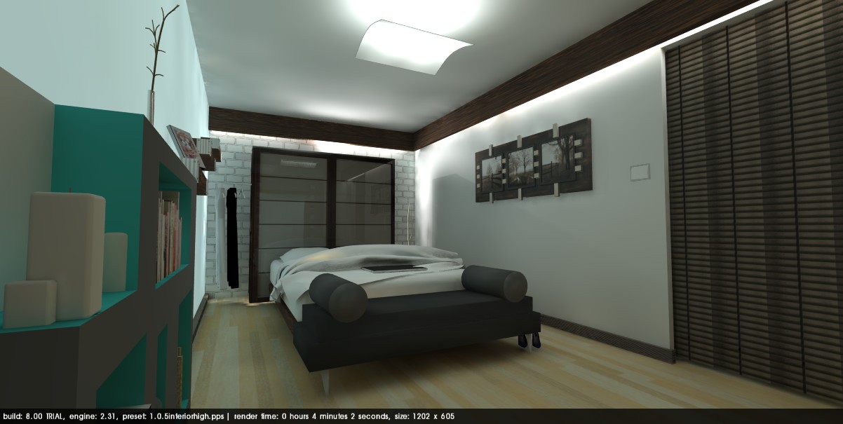
Here's a few suggestions for our bedroom from my eyes!
sketch up

podium SU


living / dining rooms

 Getter better! I can't wait to take this into Photoshop!


 I'm making my way to the lavatory! I enjoyed experimenting with the reflection in the mirror. Well, just started out as a simple rectangle that i added translucency to; then I applied 100% reflection using the podium materials editor.
 Fixed the hair....now where did the glare in the corner come from? She's just creepy, I'm getting rid of her!
Subscribe to:
Posts (Atom)