Thursday, January 17, 2013

Susan Szenasy’s METROPOLIS

Susan Szenasy’s
METROPOLIS

Susan is Editor in Chief for the world-renowned architecture and design magazine Metropolis.  She graciously constructed a presentation while on tour for the  “Inclusive Design for the Next Generation competition!”  As she took the podium she is a modest, humble and honest soul…she began to speak from her heart.  With a spirit of service she shares with us that she’s just brunt out on design contents that simply encourages creating, building pretty worthless things, spaces.  She feels that design is more than styling and more about human concerns.  So, how does good design derive?   Susan’s short answer and theory is,  “through an interest in social and ethological conditions”.

She plays a short film and introduces her audience to several teams of people whom had an interest in this very thing, or simply asked a question.  We learn that Genware, the Hydro Wall, Lunar Residence Streetlights, and the Solar Façade are all fascinating inventions by people who perhaps recognized a problem, asked themselves a question and used technology to solve the problem.  Careful not to believe that technology solved the problem, only helped.  We understand and it’s demonstrated that there are “NO limits to human imagination” . 

I am also intrigued that Susan unveils common mistakes / obstacles that often prohibit many of us from moving forward with our creations.  She identifies “Funds” or the lack of, would be the number one obstacle that many of us face when we set out to design.  Therefore, she explained that one could have to fund one’s very own project.  Also, bringing in investors would be a strongly urged to jumpstart a project. 

Question : “How do you step into the dialogue of sustainability?”  Susan encourages her audience to “think of a built environment in an organic perspective”.  She believes that incorporating multiple disciplines when designing a building is really the best approach from the start. 

Question  :  Do we allow outdated technology and methods dictate our level of thinking and doing?  Or, do we rise to the occasion and utilize recent discoveries in technology to advance in sustainability?  How do you make a building breathe on it’s own, produce it’s own heat?

Design has to be at the center of solving problems?
Where will I fit in the dialogue?


Visit to Pickett Cotton Mill

group photo by Eileen Carroll


Visit to Golden Belt, Durham NC

 We took a trip over to Golden Belt to experience 1st hand a building with similar rehabilitation qualities. 


cover for booklet

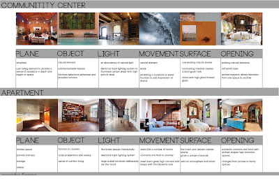
We're compiling a booklet full of analysis [documents, images, precedent study, research] of the third places we may integrate in our design for PCM.


Programmatic Research


Haiku


revised haiku

photo credit:  http://www.brownsguides.com/blog/children-of-the-loom1/

cover for programmatic booklet


matrix & site plan for PCM


space planning


Over, Under, Around and Through

We've entered the initial diagramming and is headed to the schematic phase. We begin with the first floor spaces paying particular attention to the public circulation into and through the building, working out interior space configurations in concert with the parameters established by the original window openings and the column grid. Also address vertical circulation from the first floor down to the ground floor, up to the second floor, and out to the site including at least one accessible entrance.

To communicate the schematic designs for the first floor, we will prepare and present the following:
  1. An overall plan for the first floor indicating additions of interior wall systems and doorways as well as window openings. This plan should be at 3/32” = 1’-0 “ scale.   It is important to show how your schematic design works in the context of the existing columns and windows. It is also important to be sure your design meets egress requirements. Assume for egress that the building is sprinklered and that the use is mixed use.
  2. A vertical section cut across the first floor illustrating new walls, openings, and ceilings. This should be at 1/8” = 1”-0” scale and should be cut perpendicular to Redding Drive. (Across the 100’ width.)
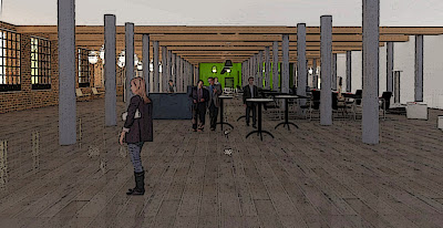
  3. Three perspective views illustrating two key spaces on the first floor and a typical public circulation pathway. Make the perspectives each large enough to fill an 11x17 sheet. Suggest light, color, and materials. Use the perspectives to illustrate your tactics for these spaces and the vocabulary of materials and features as they relate to the historic materials and features.

1st Floor Plan / Sections


branding


perspectives


with a filter in PhotoShop


Feedback from the Professor

Desk Crit:

Over, Under, Around and Through

Jo's Feedback: Trusses are not speaking the same language as the building.  They fight with the beams.  Adding such an ornate element doesn't respect what's already there.
MY reply:  this is well received because my main objective is to celebrate the authentic nature of the building.

Jo:
  1. add stairs to exit corridors
  2. avoid interrupting the main entrance with walls 
  3. sprinklers must wrap bar/grill area
  4. staircase in southeast entrance/exit
  5. path of egress exits can not be accessed through functional spaces
  6. rethink north corridor exit
  7. reposition deck/stage on north end 
  8. show topography
My reply:
Ready Set Go....Just when I thought this was the final design.

Pickett Cotton Mill + The People + The Machinery

My initial thoughts of Pickett Cotton Mill was that it was a place that meant so much to a lot of people and that the building itself held countless memories. Upon entering PCM one word dominated my mind "rhythmatic". The columns, the pilasters, the windows and even the machinery that once defined the space. I since learned that the people who worked here were accustomed to very systematic and routine lifestyles. Inside the doors of PCM as well as within the community, there was a sense of order and structure; which provided a wonderful life for so many. Success of the mill and the cotton manufacturing process was definitely one that required skillful flow each day. One of the most critical and important stages of this process was spinning. It is part of the textile manufacturing process where three types of fibre are converted into yarn, then fabrics, which undergo finishing processes such as bleaching to become textiles.

The People and the machines were just as interwoven as the fibres were to one another. Once that idea resonated I became fascinated with how well the two blended. You just can’t have one without the other.  I continued to research the spinners in particularly and discovered that there are generally one or two types:

·  The mule was an intermittent process, as the frame advanced and returned a distance of 5ft.It was the descendant of a 1779 Crompton device. It produces a softer, less twisted thread that was favored for fines and for weft.

·  The ring was a descendant of the Arkwright water frame of 1769. It was a continuous process; the yarn was coarser, had a greater twist and was stronger so was suited to be warp. Ring spinning is slow due to the distance the thread must pass around the ring, and similar methods have improved on this; such as flyer and bobbin and cap spinning.

I am certain that PCM used ring spinners. I am also certain that to capture the heart of the mill in my design, I must pay homage to the two most essentials of PCM’s time…The People + The Machinery.  I want to do so with the same rhythmatic, systematic, symmetry, and verticality as they once did. And as always, there a softer side of things, image 4 depicts another essential element of the mill, cotton!  It is also one that I will be careful to infuse in my ideations of an industrial design to the revitalization of PCM. I will be certain that there is a sense of authenticity!


 mule spinning [the people]

textile equipment [the machines]

ring spinning [the people]

cotton [the softer side]

photo credit image 1 
photo credit image 2
photo credit image 3
photo crdit image 4
http://en.wikipedia.org/wiki/Spinning_(textiles)

Mid-Term Presentation

The following work displays updated floor plan and sections based on the feedback from my professor as well as an in depth research analysis on my initiative. 

Overall presentation board!


Rendered in Sketch-Up
 
Artistic filter applied in PhotoShop supports the industrial feel. 
  Rendered in Sketch-Up
Artistic filter applied in PhotoShop supports the industrial feel.    
  Rendered in Sketch-Up
Artistic filter applied in PhotoShop supports the industrial feel. 
 

IAR 412-02 Mid-Semester Review

We had the honor of presenting to and being reviewed by several industry professionals!
Following are the guest reviewers that I spoke with and their remarks:

Mitch Wilds (State Preservation Office)
  • artist spaces could provide more privacy for the professionals
Tim Simmons (State Preservation Office)
  • lounge area maybe too open, guests need to feel some type of enclosure
  • a short 4' or 5' wall near seats
  • ramps at each end to comply with ADA
  • can make more money making bar and grill a full restaurant experience
Eddie Belk (Architect)
  • prep kitchen for bar areaC
  • perhaps too much space for art galleries
  • celebrate height of building, raise restaurant area to about 24 to 30 inches
  • media center may also be too large
Dorothy Darr (Advocate for SW High Point)
  • enjoyed the layout and the graphics of the board 
Dot Kearns (Advocate for SW High Point)
  •  suggested incorporating a teacher supply store
Lauren Postlmayr (IAR Graduate student)
  • build stairs at south entrance 
  • if there are 3 elevators spread them out  more, perhaps 1 on the north end
  • columns are enormous, check size
  • reading tables in media area
  • lounge within welcome area  
  • breakout sections near ballroom
Jerry Leimenstoll (Architect)
  • having the elevators and atm machines closer to the south entrance for residents could be more convenient and desirable
  • circulation - the columns right in front of the south entrance interrupts the flow of  smooth circulation

Next steps for Picket Cotton Mill