Sherwin-Williams' 2016 Color Of The Year Is.. White.
Sherwin-Williams announced its 2016 color of the year today, and it is -- are you ready for this? It's white. Again.
Technically called "Alabaster," it is a hue "symbolic of new beginnings," Sherwin-Williams said in a statement and "represents a straightforward and necessary shift to mindfulness, well-being and an atmosphere that is pure,” its Director of Color Marketing, Jackie Jordan, added.
It's also the third white to be chosen as a color of the year this year, preceded by"Simply White," picked by Benjamin-Moore, "Cappuccino White", Glidden's choice, and "Bowstring" and "Ivory Keys," which are deemed color trends by Behr.
In case you can't picture it, here's what Sherwin-Williams' choice looks like upclose:
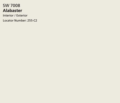 COURTESY SHERWIN-WILLIAMS
If it feels like you're being bombarded with shades of white this year, you can blame your peers: "Sherwin-Williams spends an extraordinary amount of time researching color trends and why certain colors are resonating with certain people," Jordan told The Huffington Post in an email. Its National Home Design and Color Survey found that 73 percent of respondents liked "Alabaster" for its ivory tone, rather than plain white.
"We feel that whites are resonating with consumer attitudes across genders and generations rather than one specific group," Jordan said.
As described on its website, Sherwin-Williams' Pura Vida campaign focuses on earth tones, or colors reminiscent of "the elements that remind us to live well, be well, and stay well. Alabaster holds so much symbolism for peace and tranquility," Jordan told HuffPost.
"We have found that consumers are overwhelmed and are finally coming to the realization that they need to slow down, commit to down time, get away from technology, enjoy solitude or quiet evenings in the company of family and friends. White is the perfect color to soothe a space and calm the soul," she said.
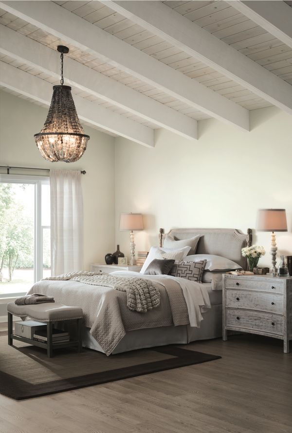
To use it in a room, Jordan recommended to use "lots of layers, shapes and textures and a combination of matte and glossy surfaces. Think heavy knitted throws, sleek white marble, white birch logs, shag or Flokati rugs, white subway tiles, architectural elements, geometric or organic pottery shapes."
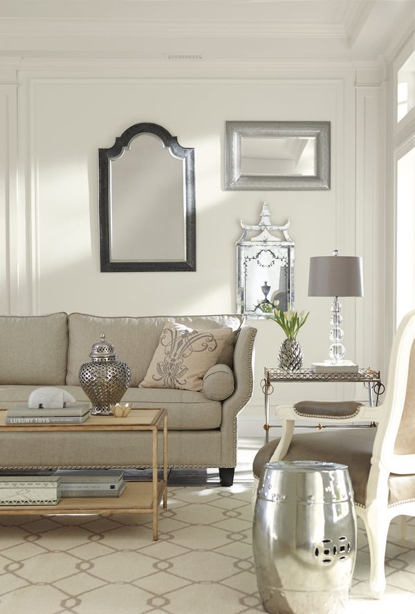
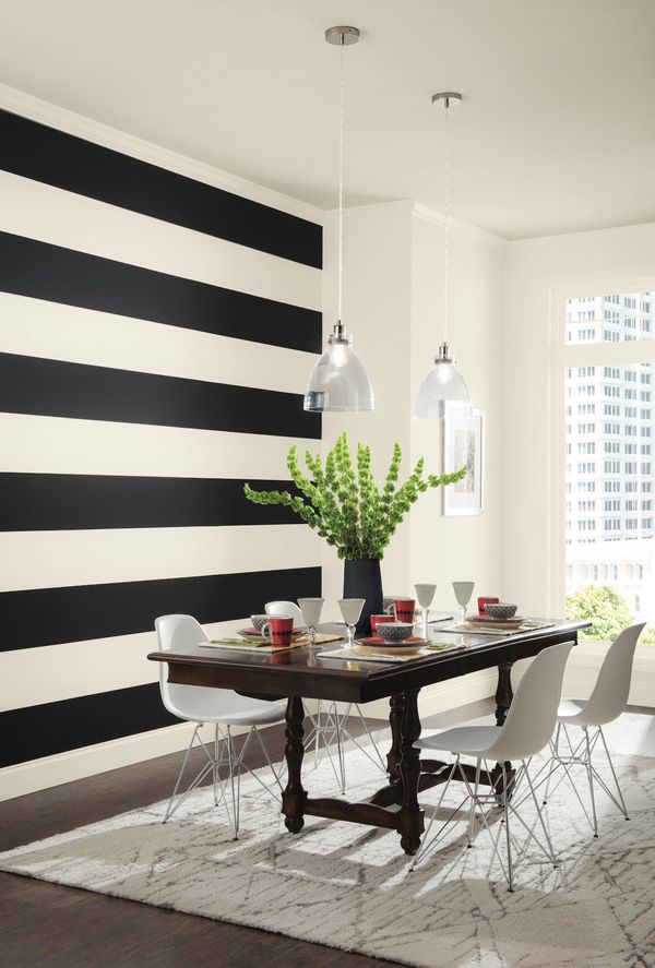
Here's how "Alabaster" looks in a room:

James CaveLifestyle Staff Writer, The Huffington Post
No comments:
Post a Comment